Understanding the Problem
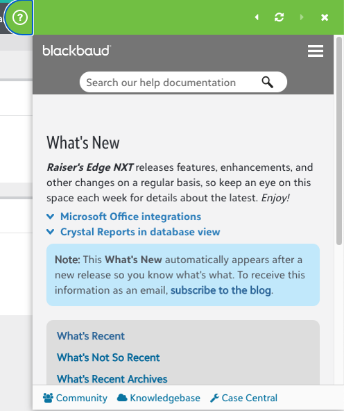
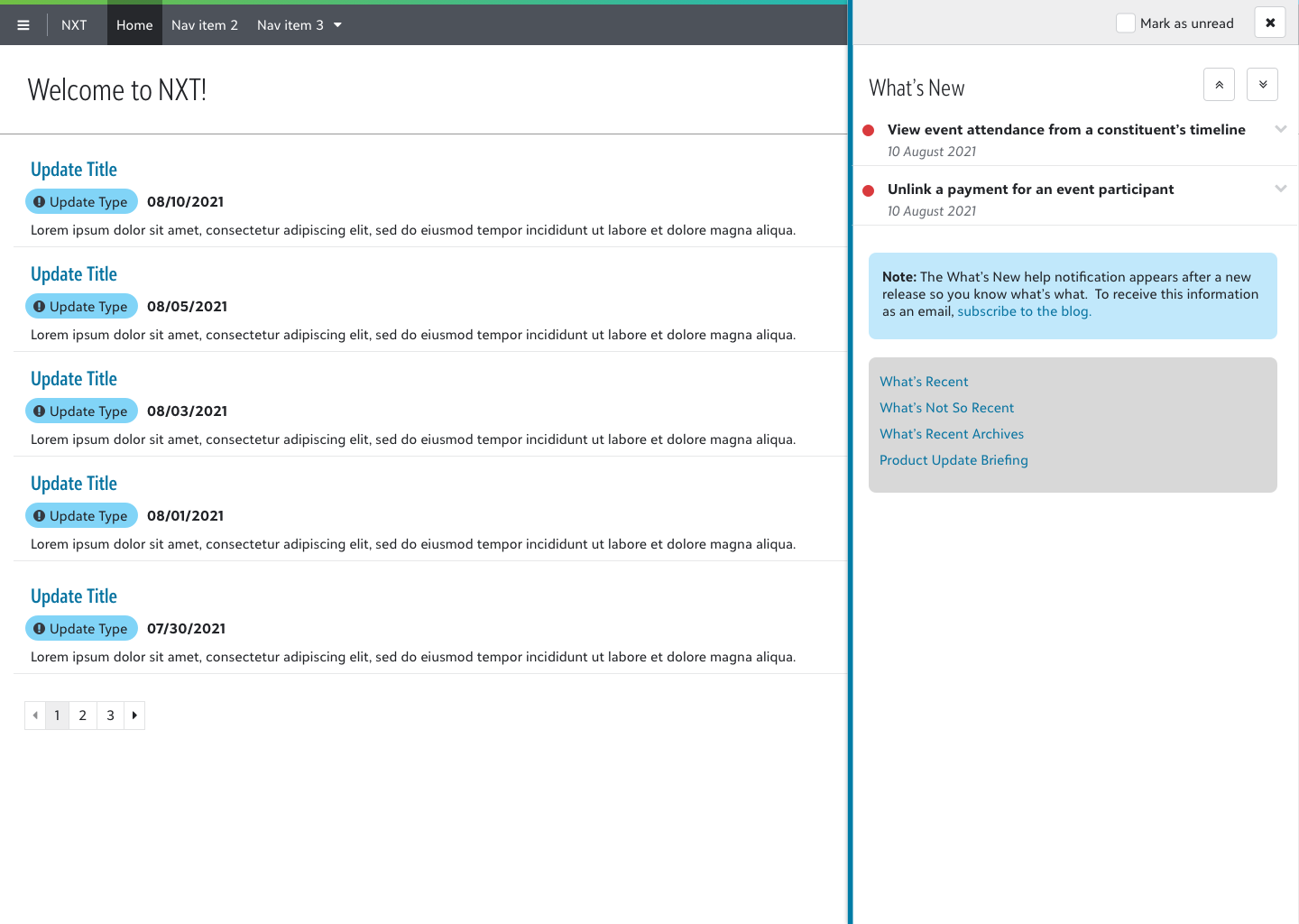
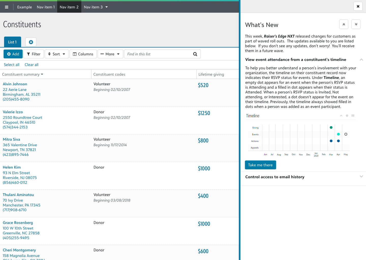
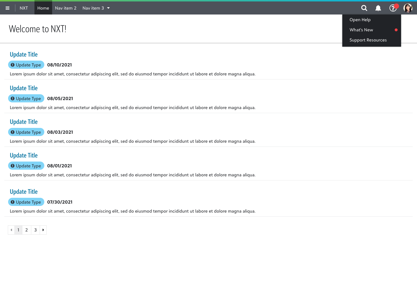
The Blackbaud Help Widget has long served as the primary source of in-product user assistance across all current Blackbaud solutions. Displayed as a green tab aligned to the top-level navigation bar, the widget expands into an elevated panel that overlays the current page. In addition to offering how-to documentation, it also provides access to weekly “What’s New” posts published by the Strategic Content Development team to inform users of new feature releases.
However, the Help Widget has proven difficult for the Strategic Content Development team to maintain, prompting a collaborative effort with the UX team to deprecate it across all solutions. As part of this initiative, a key challenge emerged: how to reimagine the in-product experience for “What’s New” content in a way that preserves its visibility and utility for users.
Project Goals
Based on insights from the competitive analysis and early stakeholder conversations with the Strategic Content Development team, I established the following design goals for the new What’s New experience:
Provide non-intrusive announcements for users to learn about new features.
Surface What’s New content in a way that informs users without interrupting their primary tasks when they land in a Blackbaud product.
Direct users to additional information on how to best use new features as part of their regular workflows.
Connect users to deeper documentation through the external help center, giving them a path to learn more at their own pace and share relevant updates with colleagues.
Design a responsive, product-agnostic solution to be implemented across the Blackbaud product platform.
Create a flexible experience that can be implemented consistently across Raiser’s Edge NXT, Financial Edge NXT, Education Management, Church Management, and future products without requiring product-specific customization.
Ideation and Design
To explore new possibilities for surfacing feature announcements within Blackbaud products, I began with a competitive analysis to identify common industry patterns for in-product updates. This helped establish a foundation of best practices and user expectations.
From there, I created several low-fidelity mockups to illustrate potential directions. These early concepts were reviewed with the Strategic Content Development team to ensure alignment with their goals and constraints. Their feedback helped refine the strongest ideas into high-level prototypes, which I then tested in discovery sessions with users.
Two primary design directions emerged from this process:
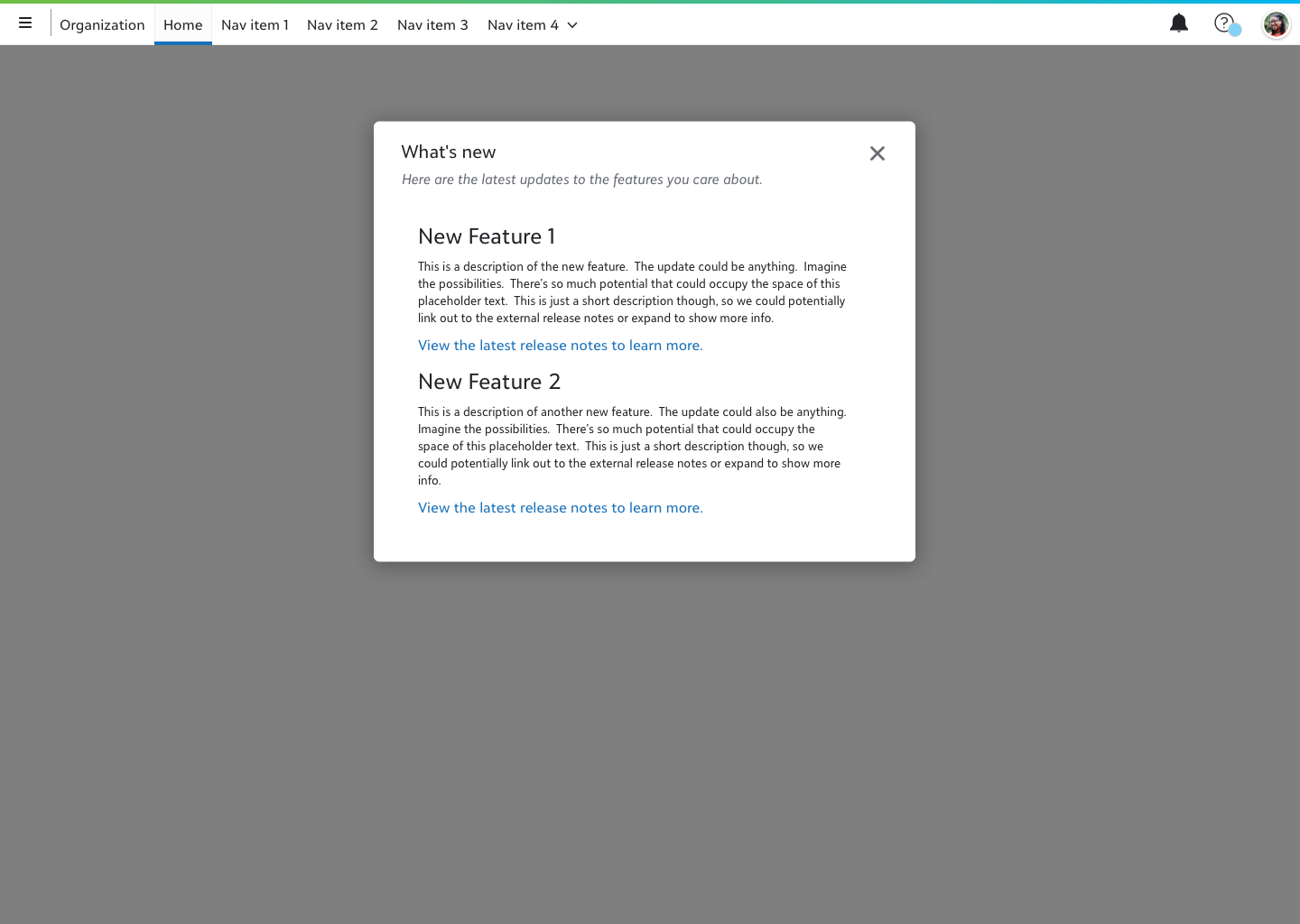
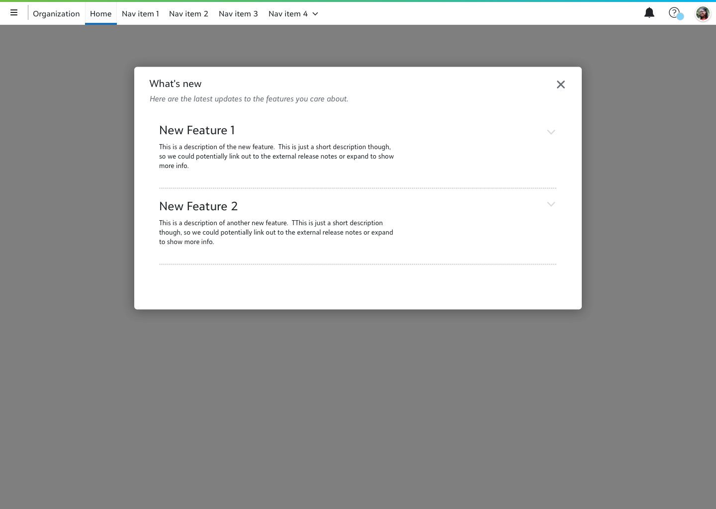
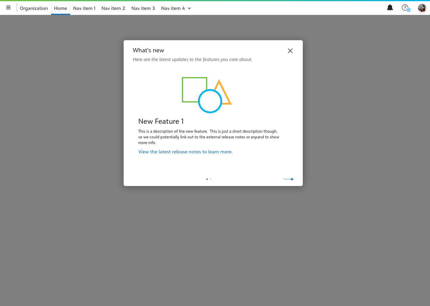
Modal View
In this concept, selecting the “What’s New” item from the omnibar help menu would launch a full-page modal window showcasing the latest feature announcements. I explored several layout variations, including a paginated format and an expandable repeater view, to accommodate different content structures and reading behaviors.
Flyout View
This version preserved the interaction pattern familiar from the current Help Widget, using a right-aligned flyout panel. By leveraging the SKY UX flyout component, this approach balanced user familiarity with technical efficiency. The design also offered improved readability and space, addressing a common pain point in the existing experience.
Discovery
The primary goal of the discovery phase was to understand how users currently engage with Blackbaud’s What’s New posts and how these announcements fit into their mental model of the overall product experience. To guide this exploration, I developed a semi-structured interview guide with 11 open-ended questions focused on how users typically learn about new features, what they find effective or frustrating in the current experience, and how well the Help Widget supports their needs.
Interviews were conducted with nine participants from various nonprofit organizations using Raiser’s Edge NXT, Financial Edge NXT, Education Management, and Church Management products. Each session lasted approximately one hour. After the interview portion, I walked participants through interactive prototypes of the modal and flyout concepts to gather qualitative feedback on usability and perceived value.
Several clear patterns emerged. Users rarely sought out What’s New content proactively. Most learned about new features informally, through colleagues or support interactions. The Help Widget was widely perceived as dated and difficult to scan. When shown the two prototype directions, participants responded more favorably to the modal format, citing its centered placement and focused presentation as reasons they’d be more likely to engage with it.
“With this one [the modal design], I’m probably more apt to look at it closer because it’s right there. Because it’s more centered.”
“I think this is a little cleaner than when it pops in from the side. It just tells me what I need to know and I can sort of scroll through.”
“[The modal pattern] brings much more focus to ‘pay attention to these things right now’.”
Participants also responded positively to the “Mark as unread” functionality, recognizing it as a practical tool for deferring review to a later time or sharing with a supervisor.
“If I saw there was a notification and it caught my eye and was interesting…if I wasn’t able to go bring it to my boss right away, I would mark it as unread so that I didn’t forget it was there.”
Iteration on the modal design during testing also surfaced a tension around modal size. Larger variants signaled greater urgency or required action to some users, which ran counter to the goal of a non-intrusive announcement.
“I feel like the larger that it is…I feel like there’s more that I need to do with it.”
These sessions also surfaced the organizational insight that shaped the personas: how users engage with feature announcements is largely determined by their organization’s structure rather than individual preference.
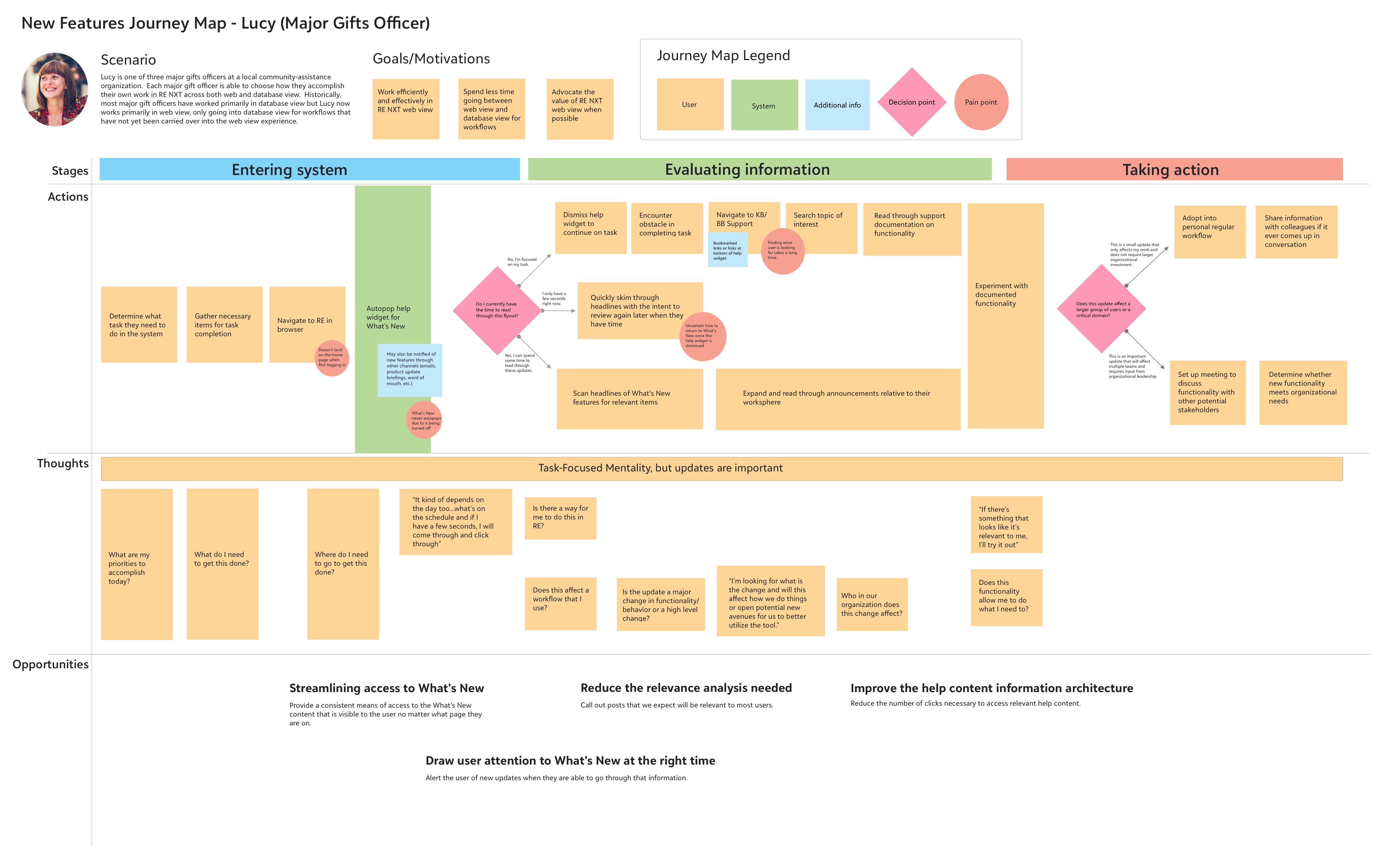
Personas and Journey Maps
The most significant finding from the discovery sessions was a structural one: how users engage with feature announcements is shaped less by personal preference than by how their organization distributes information and ownership.
Based on the user interviews, we identified a clear difference in how horizontally-structured organizations manage new feature announcements compared to vertically-structured organizations.
With these two organizational profiles in mind, I crafted two user personas, one within a horizontally-structured organization and one within a vertically-structured organization. I also created user journey maps to illustrate how each persona interacts with the current What’s New system for new feature announcements and the opportunities for us to improve the experience within each user journey.
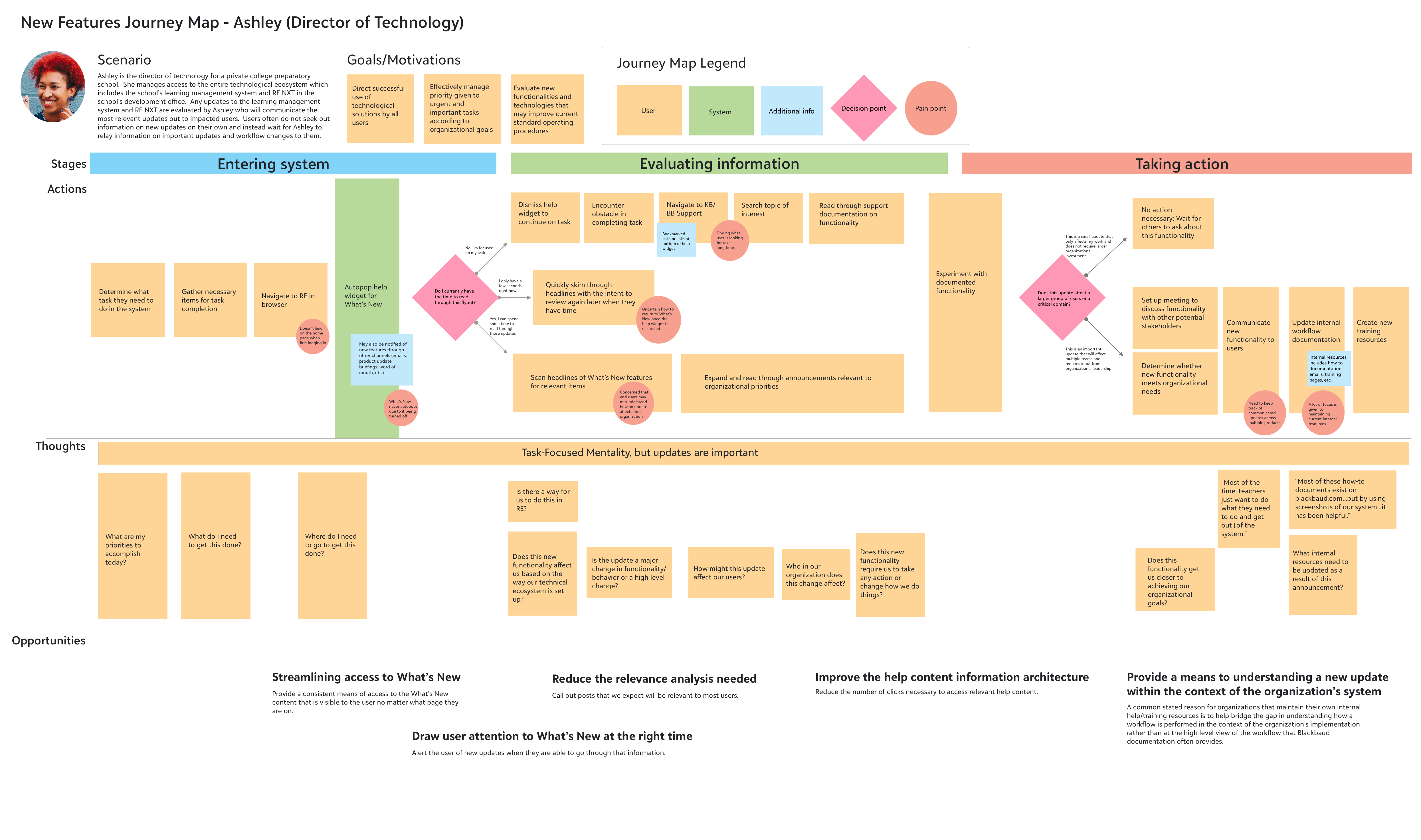
Horizontal organizations
Horizontally-structured organizations provide each user with complete ownership of their domain and workflow. As such, each user is responsible for staying up to date with the latest changes in the product that affect their workflow and knowledge-sharing of new features within the organization is typically an informal practice.
Vertical organizations
Vertically-structured organizations typically have standard operating procedures for how tasks are completed that are determined by organizational leadership. These organizations will typically have a designated person on staff to evaluate new features and determine organizational adoption. This leads to a practice of knowledge-sharing where most users will largely ignore any in-product new feature announcements and will instead wait for the designated person at their organization to share information on valuable new features or changes in standard operating procedures.
Revisions
With the feedback from the user discovery sessions and a better understanding of the user journey in hand, I made revisions to the designs to support a multi-faceted help strategy for how users will access the What’s New content following the deprecation of the help widget.
Trigger
Rather than automatically opening the What’s New notification when the user logs into the product, a red indicator is attached to the help menu in the top-level navigation bar when there is new update information to view. The red indicator communicates a system change similarly to the notification menu that sits to its left and helps the user learn where What’s New information lives within the product if they want to return to the information at a later time.
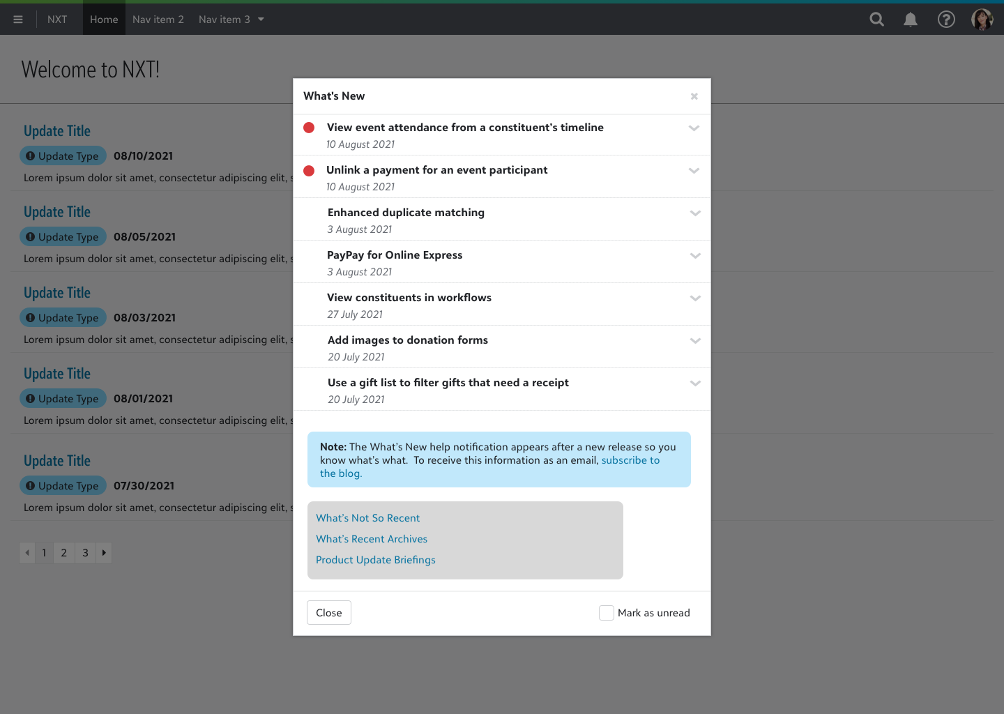
In-Product Modal
The revised modal window shows an expandable repeater view of the most recent features to be introduced to the product. Users can easily scan the headlines to find information that is most relevant to their own workflow. Additional links are provided at the bottom of the window for more information via the product’s external help center site.
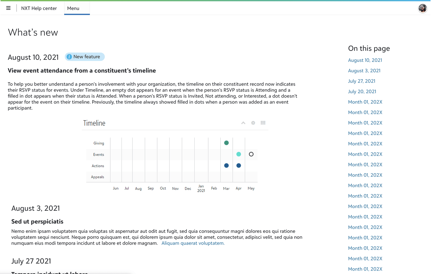
External Help Center
Each Blackbaud product has its own external help center site where new feature documentation is maintained. The external help center provides users with a dedicated area to seek out relevant information as well as a unique page URL to share information with others.
Outcome
This project was ultimately deprioritized when resources needed to complete the Help Widget deprecation were redirected elsewhere. However, the research and design work completed during this engagement — including discovery interviews with nine nonprofit users, two user personas, journey maps, and tested prototypes for both the modal and flyout directions — remain available as a ready foundation for implementation when the deprecation effort resumes. If the project were to continue, my immediate next steps would be usability testing with the revised modal design to evaluate discoverability of the notification trigger and comprehension of the What’s New content structure. I would also want to explore the responsive behavior of the experience across device sizes to ensure the solution holds up across the full range of platforms Blackbaud users work on.